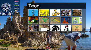
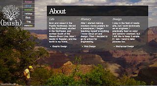
So after days of sitting at a desk, code-monkeying away like a World of Warcraft champion, I have finally produced something that I deem fit for the internets.
(yes, I DO own that hostname, as well as the hosting. Can you check #26 please?)
This is just another portfolio site that demonstrates the stuff that I do (which isn't much). It has gone through probably about 15 different phases of ideas and layouts before it finally came to this. Although there are plenty of things that still bother me about it, I think it looks pretty good, and I plan on keeping it for a while. I would certainly consider this the creation of an excellent personal website (#25).

It consists of an extremely simple three-sections: Design, About, and Contact. The Design section contains all of the pieces of work that I'm displaying.
(See the bottom of this post for a dumb secret about this section that is pertinent to the post!)

The navigation bar is very simple, but features all necessary links. The first three are anchor links to the respective three sections of the page. Using a scroll code from the Dynamic Drive DHTML library, when an anchor link is clicked, there is a smooth scroll to the appropriate section of the webpage.
The Contact and About sections are very simple, and have slight text-shadows to make them a bit more readable. Like most of this site, everything will work on a computer that is totally basic, 800x600 screen size, no java, no anything. It won't look as fancy, but everything will still be there. It was a bit difficult designing everything this way, and it may also be a bit pointless, but it's good form.


One of the coolest features of the site is the gallery of design works. I used an image magnification jquery code called Highslide. It is extremely customizable, and allows for everything I needed it to. You can find more information about Highslide at www.Highslide.com.
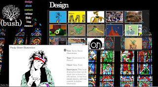
One of the cool features, demonstrated to the right, is that once you've enlarged an image, it disappears from the gallery, and the enlarged image can actually be moved around the screen.

 The final feature can be demonstrated in the above two pictures. Notice the background smallens down? That's another nifty code created by Aaron Vanderzwan, called MaxImage. You can find out more about what he does at www.aaronvanderzwan.com. It's another jquery code that resizes an image to fit the background of any window. It also had a great built-in feature that I ended up utilizing that, if you haven't noticed yet, changes the background after a time delay.
 That provided a great way to demonstrate some of my photography, as well as some pictures of myself, without having to include them anywhere in the layout. The bottom left of each page has a label of where the picture was taken, and the changing adds an excellent amount of life to the entire site, and I am a personal fan of photographic backgrounds.
A Secret from the Background (#85)
You can't tell, but it just so happens that for this site, I learned a good amount of PHP coding, and learned how to install and use a MySQL database. From above, the Design portion of the page is all dynamically created depending on the contents of my 'design' database. The same is also true for the background images. This will make this site incredibly easy to update, and I have learned a lot from creating it (at a cost of nothing except for about two weeks of life).
All that said...
If you take a look at the site, please let me know what you think. Let me know if something doesn't work, or if it's going too slow. I am happy enough with the site that I'm now advertising it, but I know that it is by no means complete or perfect. I need to know of problems before I can fix them, and it's all part of the learning process, so please give me any critiques or suggestions or anything, I'm open ears.


No comments:
Post a Comment